MDW
82
State festival of design
Identity Design
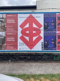
Campaign
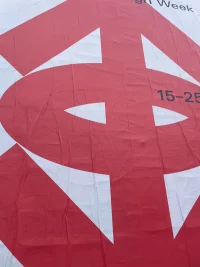
Logotype
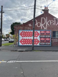
Signage
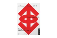
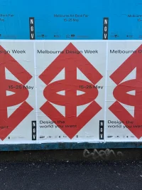
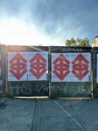
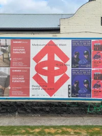
DESIGN THE WORLD YOU WANT
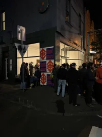
How do you represent a future you haven’t seen yet? Design doesn’t just describe the world. It reshapes it. It reorders the sensory field. It gives us new systems, new signage, new semantics. New ways of seeing. New ways of doing. New ways of being. Melbourne Design Week—the state festival of design programmed by the National Gallery of Victoria—is a sprawling constellation of exhibitions, talks, installations and interventions. Design Week is a misnomer given it runs for 10 days, though, it is not an event bound by a timeline or measured by foot traffic. Spread across a city, but also borderless. It is a provocation. A reminder. Highlighting the proliferation of design throughout every facet of our lives, irrespective of where we place ourselves in the design conversation. Whether ambivalent or academic, true design by nature is inclusive.
A DECENT PROPOSAL
To design about design is a visual riddle. Design is no single image. There is no dominant material, no static perspective to rely on. The answer could be in the fact that ‘design’ is both noun and verb. Outcome and action. Product and participation. ‘Design The World You Want’ the curatorial theme for Design Week is a proposal that is both call to action and question. It is the invitation disseminated en masse. The flyer flapping around the edges of our imagination. With that one phrase we are invited to consider the world as we experience it as individuals, while also placing ourselves within a universal context. It asks us not only to look outward, at the world around us, but inward too. Not just to interpret, but to define, seek and dream. To extend beyond reflecting the world as it is and to imagine what it could be. It speaks to the idea that design is thoroughly human and that somehow our existence is tied to an inherent, instinctual need to imagine and create better solutions.
However, design can be stratified. Perceived as an opaque, solid surface. The sole domain of design practitioners and theologians—institutionalised and gatekept. How then, can design reach those who aren’t part of the institution? To move beyond a circular, insular, designer lovefest and rope in audiences removed from the deeper conversation. How can it stop them in their tracks? To capture the civic consciousness. To be omni-present and a conscious presence in their daily life. Beyond jargon, beyond academia, beyond 10,000-word design rationales. Instead through immediate arresting symbols. Bold. Impactful. Instinctual. Eye catching, but not eye candy. Surface appeal and conceptual depth. Encoded with plurality. Something for the design die-hard and the indifferent. To cut against the grain and through bias.
CHAMPIONING MULTIPLICITY
Throughout history, symbols have carried a transformative power. They’ve marked moments of clarity and collapse. They’ve acted as rallying points, calls to action, lenses through which we see. They are composed of many layers, reaching the widest possible audience while remaining dynamic and engaging. Universal beyond geographic alphabets, they can shape shift depending on their context. Whether it be a global corporate logo or archaic religious iconography, symbols prompt an initial moment of association, perhaps followed by a will towards subscription. At best, deep identification. They encapsulate a number of narratives to achieve this, championing multiplicity. The process of decoding these narratives is akin to watching an episode of The Simpsons. Both infantile and intelligent, it depicts suburban brain-rot with cathartic irony and pathos. Here the audience produces the meaning. Each viewer becomes co-author, playing with the elasticity of meaning, exploring how it can be stretched. As evident in Season 6 Episode 12 “Homer the Great”, in which Homer joins ‘The Stonecutters’—a freemason like cult—and is punished by pushing a boulder up a hill. Read as comedic absurdity by child, and Sisyphean satire by adult. Connecting to each audience member, with meaning, on their level. Not by lowering or lessening, but by layering.
THE URGENCY OF IMAGE
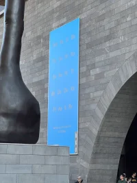
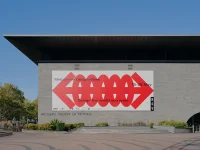
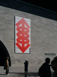
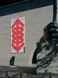
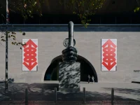
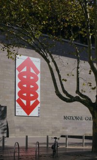
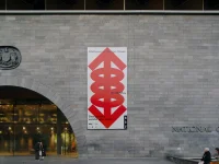
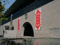
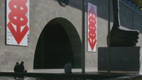
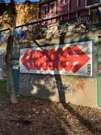
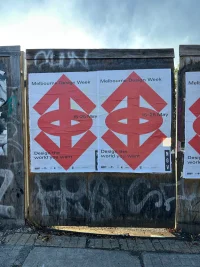
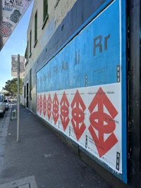
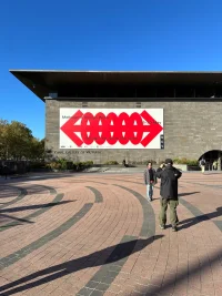
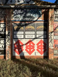
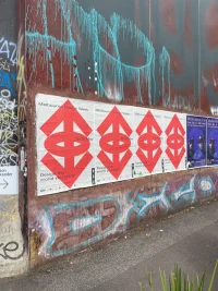
Symbols ask us to travel, to trace their meaning. In doing so they become both visual and gestural, avoiding the need for linguistic explanation. Sight before sound, an immediate confrontation. They embody the movement and vision required to project alternative realities. A symbol is both seen and grasped, or at least reached for. So what do you see? A big red arrow, an infinite loop, a cartoonish pair of eyes, a galaxy, a sigil. It could be all of these things and more. A universal marker, pointing not in a single direction, but in many. Spiralling, infinite, seeking the edge of futures unseen. It invites participation and exploration—an unbound compass, asking us to choose our own adventure. Designed like the event itself, to move across formats, across platforms, and across interpretations. Within its compact body, it contains a constellation of ideas. From Herbert Bayer’s “Field of Vision” where perception isn’t fixed but spatial, mobile, constructed. That vision can be expanded, redirected, redesigned. To the spirit of Paul Rand’s “IBM Eye”, offering a pervasive reminder that identity doesn’t have to be loud, conservative or of-the-mould to be lasting. That designers shape culture not with noise, but with novelty and clarity. Drawing from Otto Neurath’s Isotypes, it adopts the belief that good design is democratic. That information should be made visible, not obscure. That visual language can be a tool for equity and understanding. Like the work of László Moholy-Nagy, it expresses the conviction that design should not sit still. That cities and images and people are in constant flux, and so too is design. That technology can augment but not replace our sense of space and story. Inspired by Hugh Everett’s Many-Worlds Theory, it embodies a shining model for multiplicity. Imagining a world not with one path forward, but many. It embraces the idea that contradictions and complexity are not problems to be solved, but realities to be navigated and accepted. This fusing of ideas at the subconscious level of design, guides the inherent logic that ultimately gives way to that first impulse of intuition. Even if people don’t see Bayer, Rand, or Everett when they see a red arrow on the street or online—that’s kind of the point.

IDENTITY IS IMMEDIATE
Because at its core, identity is immediate. The message lands before it needs to be explained. It grabs attention, holds tension. It is flexible enough to contain multitudes, and strong enough to stand alone. A stark red outline on a street poster or smartphone screen. The arrow becomes a unifying symbol without enforcing a single narrative. It points forward, yes—but also across. It connects. It redirects. It suggests possibility. A rallying point for designers, thinkers, and the public. A visual shorthand for shared momentum. Design the world you want? That world begins not with answers, but with agency. Not with consensus, but with contribution. Not with perfection, but participation. And so we return to the image. Simple. Striking. Full of direction, and full of possibility. A symbol to celebrate the multiple perspectives that define us. A symbol that seeks to speak to you, whoever you are, and however deep you wish to. A symbol to draw attention to design, and your role as designer in the world, whether you wear that title or not.


READ IT, READ IT, REDDIT
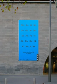
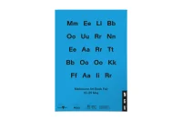
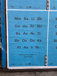
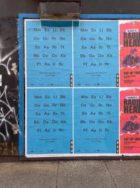
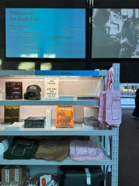
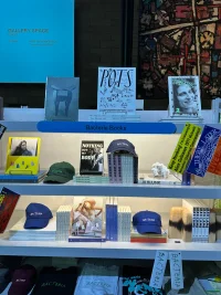
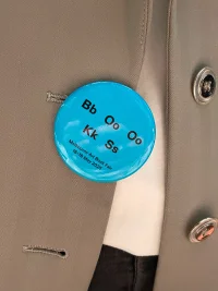
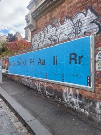
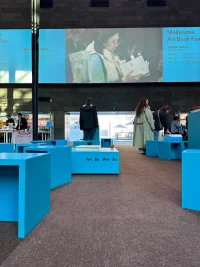
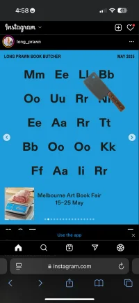
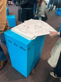
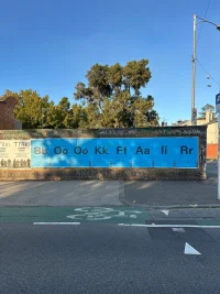
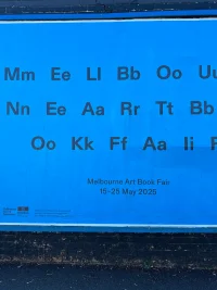
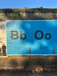
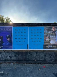
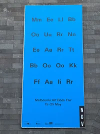
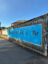
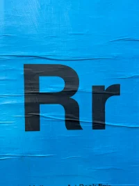
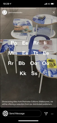
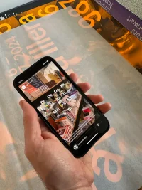
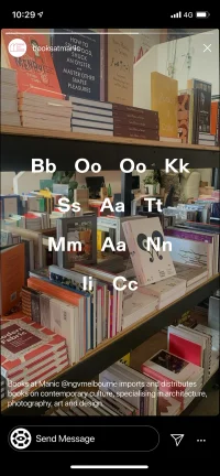
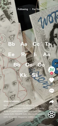
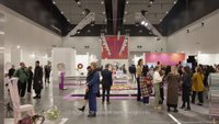
Within the broader program of Melbourne Design Week runs the Melbourne Art Book Fair, a two-day celebration of the printed page. Housed in the Great Hall of the National Gallery of Victoria; publishers, retailers and readers come together to purchase, sell and swap. The fair is another tangential exercise in authorship and readership with its own microcosm of content and community. As such a sub-ident to denote and be in dialogue with Design Week seems appropriate. Where Design Week explores the symbolic, Art Book Fair approaches, or rather, passes through the typographic. Asking us to pause and consider our relationship with language as something seen before it is understood. Like the notion of books as both object and container. Words become worlds and typography becomes a useful means of cognitive dissonance. It is used to slow down the gaze. Typeset as a type specimen come eye chart—it modifies reading behaviour. The title is hidden in plain sight, a puzzle that the mind can’t help but solve in knee-jerk compulsion. The instinct to skim in the subconscious is subverted, and attention becomes captive in the positive friction. A language that comfortably sits in dialogue with, whilst standing out amongst Design Week. An egalitarian deconstruction of the designer ‘template’ and rebuke of the expected norms of communication.
Photography: Tom Ross