LVT
02
Retailer of luxury teas built on naturopathic principles
Brand Positioning
Brand Identity
Logotype
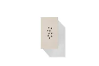
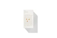
Packaging
Art Direction
Production Consultation
SQUARE ONE
Packaging originated to protect and portion. Without multiple options on offer, differentiation within a category wasn’t really a concern. The primary consideration of any design was allowing one to securely transport the contents. However, since humans first bagged, boxed, and bottled commodities, much has changed. Modern retail environments are a cacophony of colour, composition, and communication. Multiples all seek to stand out. Capture attention. Secure a sale. As rendered in Andreas Gursky’s magic-eye-like photographic work 99 Cent, retail can often feel like the physical manifestation of a social media stream. Shouting louder isn’t an inept strategy, but when volume is at odds with the spirit of what’s being packaged, a more congruent approach could both differentiate and honour what is housed inside.

[Fig 1.] Lyza Danger, The New Fred Meyer on Interstate on Lombard, 2004. (Not Andreas Gursky, 99 Cent II Diptychon, 2001).
[Fig 1.] Lyza Danger, The New Fred Meyer on Interstate on Lombard, 2004. (Not Andreas Gursky, 99 Cent II Diptychon, 2001).
TEA AS VERB
Tea has a dichotomously universal and local sensibility. Many cultures have symbolic and social traditions that centre around it. Widely consumed, tea has developed some continuity of theme but also many individual approaches and beliefs. It is synonymous with welcome and gracious hospitality in Morocco and the U.K., while in Japan, it embodies more complex concepts of self-reflection. Each corner of the globe has their take.
Chadō, the Japanese tea ceremony, translates to “the way of tea.” Similarly, the moniker Love Tea suggests an act—to love tea— to be read as verb rather than noun. Founders Damien Amos and Emma Watson embody this philosophy. For them, tea is all-consuming, shaping their worldview. Everything starts and ends with tea. Born from Watson’s naturopathic practice. Tea becomes a vehicle for infusing natures health benefits to the human condition. Blends of herbs, plants and spices have evolved into a library of SKUs. All with unique properties and flavour profiles.


SPIRIT INFUSION
Logotypes must convey much with an economy of space and attention. The distillation of Amos and Watson’s approach to tea required a visual language both immediate and cerebral. The re-composition of letterforms to create an uppercase T, via the symmetrical repetition of the ‘e’ in both ‘Love’ and ‘Tea’, serves as an intuitive shorthand whilst also suggesting more. The double emphasis on ‘Tea’ and ‘T’ establishes tea as the protagonist. The start and the end. Abstractly, more could be inferred. The ‘T’ composed of two perpendicular lines can be read as a shift in energy or state. A movement in direction or pace. Just as a cup of tea often marks a pause in one’s day. The ‘T’ can suggest a moment of stillness and transition. Alternatively, it may symbolize hospitality and conviviality. The coming together of two beings to share time and space over a cup. Like tea, it offers as much depth or surface appeal as the drinker seeks from it.


LOW VOLUME RESONANCE
With reverence for tea a foundational pillar of the business, an appropriate packaging language needs to serve as a stage for the contents. Paradoxically, a walk down the tea aisle in any major retail chain is far removed from the calm, soft pace of the experience of tea. Fluorescent palettes, flamboyant patterns, and bold graphics mask the spirit of their contents. Design language is built like a billboard. Shouting for attention. Works from the canon of minimalism, such as Kazimir Malevich’s White on White (1918) suggest another way to consider hierarchy and its relationship to negative space. In a visual landscape turned up to volume 10, a restrained, calm and humble aesthetic both stands out and quiets down. Allowing the contents to come first. Much like a pause in music. The result on shelf is a moment of silence among the noise of the category. Creating hierarchy unusually through the capture of white space and simultaneously communicating the ideology of the purveyors. Mimicking the experience of calm that accompanies pausing for a cup of tea. Love Tea creates a pause in the retail experience. A moment of calm, space, and breath.


HUMILITY IS LUXURY
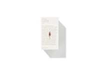
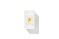
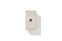
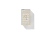
Materiality is paramount in any FMCG experience. Consumer calculus happens in an instant. A trove of attitudes are automatically formed about a products authenticity. Well-executed visuals can be good from far, but far from good—if not translated through an intentional application of production. The ideology of Love Tea is reinforced through its material choices. Grey box board and white unbleached stocks are raw and natural, embracing the ordinary. Humility made tangible. This reverence for the natural world is evident in both design and tactility. Reducing the perceived distance between the consumer and the world of the product.
Surfaces wrapped in typography outline the naturopathic qualities of each blend. Here Watson’s stories are subdued and expansive. Love letters to the contents, to be read as literature or felt as texture. Photographic depictions of key ingredients are composed in a superposition over the narrative. At once lifted up and also interconnected to the meaning that lies beneath. The resulting interface reads as a stage that puts the contents squarely at the centre. On periphery sides, supporting ingredients are depicted alongside the protagonist. Numerals as footnotes draw threads to scientific annotation and botanical traditions, whilst breeding familiarity between mind's eye and abstract Latin names.
The language becomes an invite to love tea. To consider a shift in perceptions of premium and pace. A foothold into the inherent beauty of the natural world and the prioritisation of depth over volume.