SPD
01
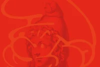
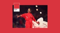
01. Colour: Red. A study of colour through culture, design, chronology and geography
Keynote
Publication
Exhibition
SEMIOTICALLY SPEAKING
Things are not always as they seem. Semiotics, the science underpinning visual communication, invites us to look beneath what we see. The study of signs and symbols unveils the difference between what is seen and what is understood. We see a red rose, but we read love. We wear a uniform, but we say I belong. From colour, to typography, to logo-marque, to paper stock. Each visual element and combination speak two tongues at once. Aesthetic immediacy—awareness, attraction or aversion and cultural communication—subconscious association and meaning. Graphic design is the application of semiotics to communicate visually (hence, it’s pseudonym visual communication). As designers our message is often subconsciously read, even though it is written with deft intent.
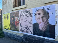
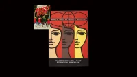
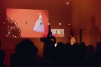
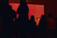
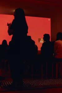
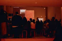
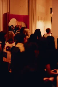
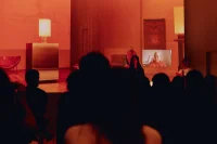
Red is the opening chapter of Applied Semiotics. A research project that examines the etymology of semiotic codes across culture and design. Debuted at NGV Melbourne Design Week, an interactive exhibit comprising a keynote with colour theorist Jane Boddy (WGSN / Pantone Institute) and exhibition of red materiality curated by curated by Oigåll Projects. Through Applied Semiotics, the project examined how visual symbols operate, mutate, and embed themselves within collective consciousness, as well as how these ideas inform both design logic and language is examined. What seem like universal truths—red means love, serif typography suggests academia—are revealed as localised associations when zoomed out through time or geography. Semiotic meaning is material, but malleable. With it we can co-opt, subvert and covertly harness meaning. If we know where, or how, to look.


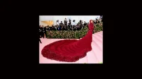


Francois Durand, Getty Images.
Francois Durand, Getty Images.
RED, PRIMARY & PRIMAL
As evidenced, colour is never merely visual. It is message, shaped by culture, history, geography, and memory. Red is perhaps the most semiotically charged of all hues. It holds danger and desire, purity and perversion, love and war. It signals without ever resolving, sustaining paradox as its defining feature. This ubiquity grants red its unmatched cultural weight. Biologically, it is the first chromatic colour infants can perceive. Linguistically, it is often the first to be named after black and white across unrelated language families. Evolutionarily, it has signified ripeness, heat, blood—visceral signs of vitality and threat. From cave walls to coronation robes, its primal force has carried through visual culture for millennia.
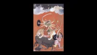
SACRED GROUND
The first ever recorded red carpet did not welcome Hollywood movie stars, but King Agamemnon in Ancient Greece. To tread upon crimson fabric was to claim the sacred domain of gods—a mortal act of hubris, punished swiftly by fate. Here red was sacred, dangerous, and deeply symbolic: both pathway and prophecy. Across cultures, this sanctity recurs. In ancient China, red marked the Emperor as intermediary between heaven and earth. In Hindu and Egyptian traditions, goddesses of strength and protection appeared clad in red. In Christian Europe, the colour of Christ’s blood was bestowed on monarchs to legitimise divine right. Wherever it appeared, red signified elevation, ceremony, and control. Blessing and curse.


POWER & PAGEANTRY
Over time, red’s symbolism migrated from ritual to spectacle. By the 19th century, crimson carpets adorned parliaments, palaces, and even train platforms, denoting status and arrival. Hollywood transformed the tradition into cultural shorthand for glamour and celebrity, culminating in the Oscars’ red carpet—a stage where visibility and hierarchy intersect. Today the code endures, yet evolves. The carpet becomes green for environmental causes, tunnels for Raf Simons’ runway at Prada, or a fashion statement in its own right like Cardi B’s quilted gown at the Met Gala. Recognition remains intact, but meaning expands with each reinterpretation.
RULE TO REBELLION
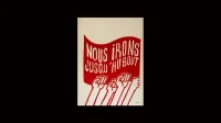
Red’s power, however, has never belonged solely to rulers. It is equally the colour of upheaval, its meaning dilating and contracting as it is pulled between movements. As monarchs draped themselves in scarlet, revolutions wrapped themselves in it too. In France, the sans-culottes rose up in 1789 wearing red Phrygian caps—a symbol of liberty borrowed from Ancient Rome, where freed slaves were given the same cap. Red became shorthand for liberation, radical politics, and defiance against tyranny. In the 19th and 20th centuries, it was carried forward in revolutions across Europe, from Paris to Petrograd.
With the rise of communism, red took on new ideological weight. The Soviet Union branded itself in crimson flags and banners; China declared Mao “the red sun in our hearts,” embedding red as both symbol of luck and political allegiance. The Little Red Book, printed in the billions, became not just text but a talisman. Yet rebellion and repression sit side by side. The same red that signified freedom in France became a symbol of authoritarian control under Stalin and Mao. Red is a colour that legitimises power as much as it topples it—a double agent within global politics with its own complex agenda.
This duality extends into cultural resistance. Suffragette posters were charged with crimson urgency. Pussy Riot’s red imagery tied punk provocation to feminist protest. In May ’68, French students daubed red slogans across walls as they challenged capitalism and authority, forging a colour-language of dissent. To this day, red is pulled between establishment and uprising. It crowns kings, but it also fuels protests in the streets. It is simultaneously banner of the state and banner of the people—a perpetual cycle of rule and rebellion.

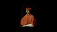
PURITY & PERVERSION
Red’s contradictions extend beyond politics into the intimate realms of body, faith, and morality. In religious iconography, red has long represented purity through sacrifice—the blood of Christ, the robes of cardinals, the colour of devotion. In Eastern traditions, it is auspicious, symbolising fertility, prosperity, and good fortune. Red is the colour of weddings in India and Lunar New Year celebrations in China. It blesses beginnings and binds communities through ritual.
Yet red is also coded as perverse, dangerous, transgressive. It marks lust and sin in medieval Christian morality; the “scarlet woman” cast as a warning against unchaste desire. Siren lights typically flash red to alert urgency and danger, grimly echoing the Sirens of Greek mythology—humanlike female creatures who were supposed to lure men to their doom. In modern culture, red lipstick and dresses oscillate between seduction and scandal, at once glamour and taboo. The Rolling Stones’ iconic red tongue, inspired by the Hindu goddess Kali and Pop Art’s irreverence, fused sexuality, rebellion, and provocation into a single marque. This oscillation—between holy and profane, pure and corrupt, romance and ruin—underscores red’s unique semiotic weight. It does not resolve contradiction but thrives on it, carrying dualities that both attract and repel.
ELASTIC CODES
What unites these histories is red’s semiotic elasticity. It can be crown or cap, carpet, power or protest banner. Its ubiquity, appearing in 78% of national flags, makes it globally legible, while its mutability allows endless reinterpretation. As John Berger reminds us, “The relation between what we see and what we know is never settled.” Red exemplifies this tension. A red dress may read as sensual or defiant, a red light as warning or invitation. The signifier (visual) remains constant, the signified (meaning) forever in flux. As Paul Klee observed, “One eye sees, the other feels.” In red, these two actions converge: visual composition meets cultural resonance. We do not simply see red. We decode it, feel it, and negotiate its layered contradictions.

RED AS MEDIUM
Red is never neutral. It is historical, psychological, ideological. It frames perception, generates emotion, and constructs meaning. Its power lies not in clarity but in contradiction. Applied semiotics offers us a way to engage with this complexity: to look beyond aesthetic preference and toward visual literacy. To understand not only what colour looks like, but what it communicates and why. Red, in particular, insists that we look again. With one eye, we see form and with the other, we feel meaning. In that double vision lies its enduring power: urgent, unresolved, and alive.
Collaborators: Studio Boddy, Oigåll Projects. Exhibiting Artists: Andrew Hustwaite, Anna Varandorff, BMDO, Brahmen Perera, Brud Studia, Cordon Salon, David Flack, DenHolm, Jeremy Blincoe, Rosanna Ceravolo, Sozou Studio, Volker Haug. Photography: Annika Kafcaloudis.