CAP
25
Contemporary arts and communal culture precinct
Brand Positioning
Brand Identity
Logotype
Wayfinding
Signage
Campaign
Collateral
Production Consultation
CIVIC TRANSFORMATION
Individually and collectively, we define what a place means and how it functions. The key to reviving and reimagining a place lies somewhere between the remnants of what once was and the potential of what could be. Place feeds from residual memory, utilising lingering traces of repetitive activity and the echoes of rituals. It absorbs and catalogues its broader surroundings and community, like a wide-reaching mycelium network. Activated by touch and sound, it consolidates energy and movement. All the while, it searches for a language—not to define itself, but to communicate.
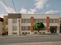
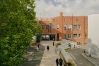
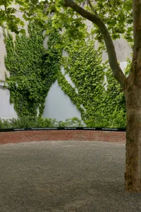
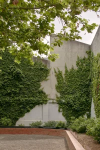
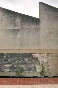
Collingwood Yards exemplifies this revival of place. A study in adaptive reuse, a former institution reimagined as a porous, civic stage and creative testing site. What was once a walled-off technical school, encircled by a defensive moat of brick and formality, now stands as an open invitation. Its transformation from closed to communal is more than architectural; it is social and cultural. Where uniformity once reigned, difference and divergent paths are now celebrated, woven together to inform a negotiation of broad identities. Of people and place.
Rather than erasing the past, layering it. Acknowledging the cycles of use and disuse, the gentrification and flux that mark Collingwood as a place. By accepting change as a constant, the Yards become not a static monument but a framework for continued authorship. Past, present, and future coexist, creating conditions for culture rather than prescribing their form.

ARCHITECTURE IN MOTION
Whether through subversion or careful preservation, architecture asserts the value of place as both witness and subject to history. It becomes a way of embossing legacy and is crucial to generating and leveraging the identity of a place. Our expectations hinge on the immediate and implied context that architecture provides.
Among the many great examples of revived strategic and industrial complexes, existing architecture is utilised both pragmatically and conceptually, embracing original form to give shape and meaning to a new purpose. The Arsenale di Venezia, London’s Tate Modern, PS1 MoMA in New York City and Collingwood Yards leverage this context. In doing so, it contributes to a local-global discourse centred around the reclamation of disused urban spaces and structures.
These complexes all express hyper-local qualities, rooted in unique histories, while assuming universal characteristics as public domains. Walking through them, you gain access to a network of likeminded spaces—the possibility of being both here and there. As a site with a long history of creative practice and civic engagement, this continuity makes a lot of sense for a place like Collingwood Yards. Preservation becomes a way of affirming belonging while exploring new ways of existing.
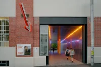

A LANGUAGE, NOT A BRAND
The identity of Collingwood Yards is not a brand in the traditional sense. It is a language—a dialect that belongs to the community, shaped by those who inhabit it. Like Esperanto or the spirit of the International Typographic Style, it seeks universality without flattening individuality. It is recognisable without demanding homogeneity; flexible enough to hold both folk movements and global conversations.
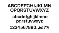
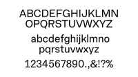
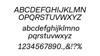
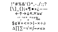
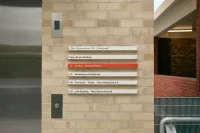
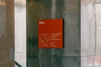
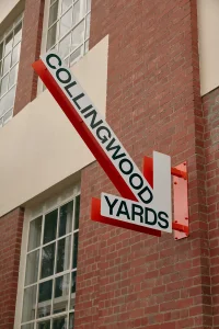
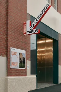
Typography serves as the visual voice of this community. A typeface born of the place—licensed with practicality and dissemination in mind—grounds the project in locality while remaining legible to the world. Civic signage becomes a kind of cultural Esperanto: a wayfinding system that is both of here and of anywhere, situating the Yards on a continuum of local and international exchange.
ARROW AS INVITATION
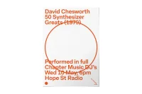
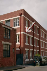
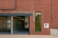
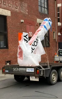
At its heart, a simple motif: the arrow. It perforates and highlights, guiding without dictating, pointing toward possibility rather than conclusion. Like programming itself, it creates conditions, not restrictions. It invites tenants in, offering a tool rather than a boundary.
The arrow also functions as a civic gesture—recalling familiar signage language, yet reinterpreted to belong to this place. It signals movement, authorship, and continuity. The Yards are not a finished object but an open framework, a hopeful, unended design language contained only by the form of the site itself.
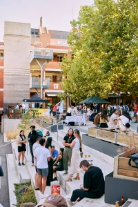
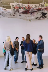
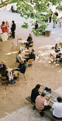
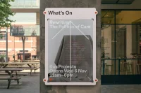
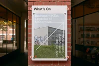
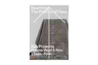
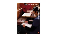
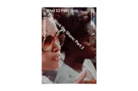
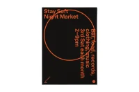
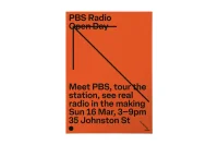
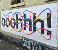
Photography: Left: @staysoftstudio, Centre: Lucy Foster, Right: @hopestradio @n.timson
Photography: Left: @staysoftstudio, Centre: Lucy Foster, Right: @hopestradio @n.timson
LOWERCASE ARTS
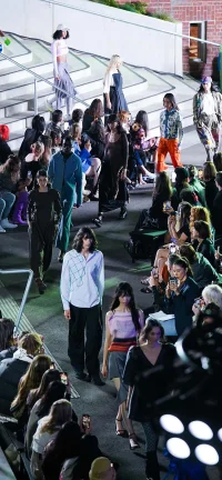
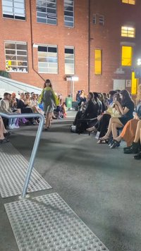
Community starts with a sense of acceptance and inclusion. Rather than projecting an institutional demeanour, a palace dedicated to capital-A Art, Collingwood Yards fosters a bustling commons. It resists the sheen of formality and embraces the texture of the everyday. This identity leaves space for tenants, neighbours, and visitors to inscribe their own authorship. This is not about control but conditions; not a system of containment but one of openness.
Here, programming and placemaking fold into one another. For the neighbour, it is a familiar gathering space; for the international visitor, it offers a unique point of cultural entry, resonating across borders while remaining rooted in its own unique local fabric. It is a site-specific dialect that speaks in global tongues.
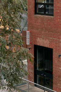
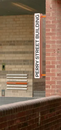
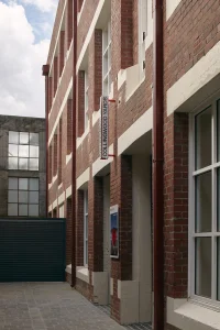
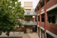
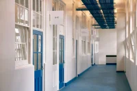

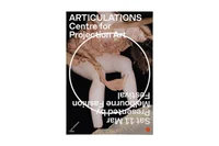
Photography: Left: @ka_he_____ Centre: @melbfashionfestival, Right: @ashleighbonica
Photography: Left: @ka_he_____ Centre: @melbfashionfestival, Right: @ashleighbonica
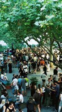
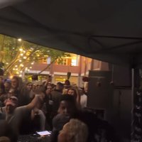
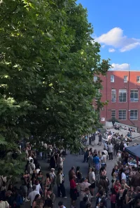
Photography & Video: @hopestradio @waxoparadiso @n.timson
Photography & Video: @hopestradio @waxoparadiso @n.timson
UNFINISHED BY DESIGN
Like Constructivism before it, Collingwood Yards embraces the tension between structure and openness. It is designed to be unfinished, to accommodate change and multiplicity. Individuality and commonality co-exist. Locality and universality overlap. This is a design language that does not close but opens—perforated, directional, hopeful. It is a civic tool, a communal voice and above all, a place where art and life remain inseparable.
In collaboration with: Signage and Wayfinding Designer: Jordan Rowe (JRCD). Wayfinding Strategist: Tim Dow (Tim Rob Don Dow). Type Designer: Vincent Chan (Matter of Sorts). Industrial Design and Implementation of Wayfinding and Signage: Micio. Architect: Fieldwork. Builder: McCorkell Construction. Animator: Bobby Dazzler. Signage Photography: Tom Ross. Marketing Photography: Dan Hocking. Installation Photography: Jordan Rowe.
A conversation between Luke Brown (LB) from The Company You Keep, Julia Greggs (JG) from Collingwood Yards, Vincent Chan (VC) from Matter of Sorts and Matt Leach (ML) from Australian Design Radio.
00:00 / 00:00
ML
Julia, I’d love to understand the background on Collingwood Yards, and what the site sets out to achieve. It seems like an incredibly ambitious project.
JG
It’s certainly an ambitious project. The site itself has a very long history; over about 120 years of colonial history. It’s a collection of three buildings and outdoor spaces that covers approximately 4.5 thousand square metres, right in the heart of Collingwood, situated between housing commission flats, new boutique apartments, the artist colony warehouses that Collingwood has been home to for the last fifty years. The idea behind the project is to essentially establish a home for small to medium arts organisations and individual artists at a below market rent, so that in these gentrifying areas such as Collingwood, you have these spaces that are dedicated to emerging and experimental artists.
ML
Luke, I’m interested to hear what the brief was, and your first thoughts on it.
LB
The brief was really multifaceted, but an interesting part of it was around this idea of authenticity and the authenticity of place. It had to unite the diverse range of individuals that make up the fabric of Collingwood, the things that make Collingwood Collingwood, how do we not ignore that? It was critical that the brand signify the site and not homogenise anything of the area. We had to ask a question – how do we empower these individuals that make up Collingwood, and champion that as a group voice in its representation? It’s important we empower and we don’t overbear; we don’t want to be too heavy handed. We want to create a recognisable visual identity for the precinct, but we don’t want to ram it down people’s throats, if you will.
ML
How do you go about doing that?
LB
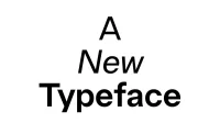
Primarily the voice is empowered by a system, or a design system. That system employs things like tone of voice or space or frequency, right down to the DNA of the typeface itself. This is one of the reasons we created a typeface, or at least saw an opportunity to create a typeface – was to embody the community history and that individuality, its uniqueness, giving this voice a sense of place.
JG
Touching on what Luke was saying, the history of the site also doesn’t necessarily speak to the totality of the future of the site. The history of the site is a place of making an education, but it’s also a very limited type of people who went to school there. It was what you imagine when you think of Collingwood as the working class of the 50s, the white Australian man. The future of the site is hopefully a lot more inclusive and a lot more accessible.
ML
It really seems like it’s not your normal branding job by any stretch of the imagination. It feels like you needed more of a voice for the community than a brand.
LB
100%, absolutely. We refer to the brand system as a language – that’s a good way to put it. It’s a language that the tenants can easily adopt. You could think of these as base elements that the community can use rather than a finished set of rules that they have to conform to. It’s not a uniform. The notion of a language was really important to us as it evokes that sense of giving a voice to a community, but being spoken in individual tones. This sparked the idea to visualise the language in the purpose-designed typeface.
JG
We had a lot of conversations about how we could provide – we called it various things throughout the process – a platform or a frame or a language that spoke to how we were seeing it as flexible and complementary to the voices of the tenant organisations, but also inclusive of visitor voices and visitor experiences.
ML
Bringing those different groups together, you’re really creating a community. How did you design for a community that doesn’t necessarily exist yet?
LB
That’s an excellent question. The way we started out, in this exact example, was to create a system that can be adopted and adapted easily. The system, like the language I spoke about previously, is a language that everyone can speak and understand, but they have to be able to put their own flair on it. They have to be able to adapt it, like slang or accents. You could think about it like that. These languages develop over time and that’s beautiful. It’s not about being a precious graphic designer saying ‘stick to my rules or else’; it’s about being open. Another metaphor we were throwing around was this idea of a set of tools to empower the community instead of a container to force them within. We should allow space and room for participation and evolution. As the community evolves the system does too, or at least that’s the idea behind it.
JG
We also had several stress test cases of tenants that we knew would be in the precinct. The way that we’ve gone about tenanting the precinct is that we have some anchor tenants like PBS Radio. Then we knew we had someone like Liquid Architecture, and they’re the completely contrasting ends of the spectrum in terms of how their brands and their identities sit. We needed something that could flex to complement both of them, or at least not overpower, and look congruent with those two types of examples and everything in between.
ML
Then also planning for future tenants.
JG
Exactly. And not knowing who they could be or who their audiences might be.
ML
We’ve discussed those. It’s not your typical brand, but there are some consistent elements that have been introduced that seem to tie it all together. The dot element, for example, that appears on posters and brochures and even envelopes. Can you tell us more about these consistent elements and why they’re important?
LB
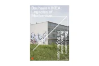
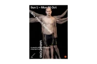
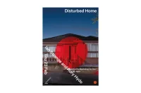
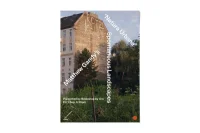
Consistent elements help provide recall and recognition, and give the formats a structure. The central dot is really just this idea of the beating heart of Collingwood Yards, the central point that everything springs from and through the communication, is anchored by. You have the brand messaging, you have the secondary messaging such as an event or a happening, and then you have the other sort of tenant communication following on from that. That system is able to flex around that central point, that circle, that dot, in a really cohesive way using the central alignment through any different kind of media. Whether it’s an EDM or a website or some print collateral.
ML
You’ve mentioned the typeface there and we’ve danced around it a bit, but Vincent, what does a typeface brief look like? What were your first thoughts when you first got this?
VC
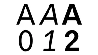
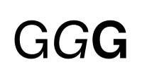
When Luke got in touch, I was immediately excited about the project because it’s quite a unique opportunity as you’ve been talking about already; Collingwood Yards is quite an ambitious project. I had also been really thinking about this notion of the specificity in terms of an Australian voice in typographic design. I’d previously worked on a project with another designer called Dominic Hofstede, on a project called Re:collection, which was around Australian graphic design from the 60s to the 90s. In that we really try to unpeel this notion of what makes Australian design and specifically Australian typographic design unique. Coming off the back of that, this project seemed to be a nice continuation of that line of thought, except it was a little bit more specific to a location, to Collingwood. We discussed a number of things about what was unique about Collingwood Yards, and that building lettering was one of the first points of contact. We took a number of photos, I did a brief survey around the area and started sketching something already. I knew it needed to be a grotesque, which is to say, sans serif, the term grotesque spelled g-r-o-t-e-s-q-u-e is a British term for the sans serif, an early British way to refer to these letterforms; obviously it sounds derogatory in some ways. The initial ones were in some ways quite shocking, hence ‘grotesque’, but obviously to our eyes, contemporary eyes, it seems very familiar. It takes on the opposite quality, it seems almost quotidian rather than distinct. I knew it needed to be a grotesque, but the tricky part was really trying to figure out how to inject a certain amount of personality in these letterforms and balancing this notion of familiarity and specificity. It ends up having to be quite a subtle nuanced gesture simply because the brief really needed to speak to such a broad audience. It needed to communicate and not overpower and overshadow as everyone’s been mentioning already, yet it needed to have a reason to exist. It couldn’t simply just be Helvetica, or another sensor from another nation; it needed to be distinctly located.
ML
Luke, when in the brief do you realise that a unique typeface is needed?
LB
Before engaging Vincent we had explored lots of different typefaces that we felt could be appropriate and we ranked them and assessed them. None of them basically really felt right. Using a Swiss typeface made in midcentury for a community art space in Collingwood felt disingenuous. So we thought the way that we can give something unique to Collingwood Yards can come through the typeface. We’d always been fans of Vincent and for an organisation this large, the outlay for a typeface that’s just purchasable can be really prohibitive. If you look at the cost benefit ratio, creating something custom is actually not as expensive as you might think. It can actually provide a lot more value to the organisation than just simply purchasing a font from a foundry.
ML
Vincent, a lot of people looking at the work won’t understand the process of creating a typeface. Can you give us a quick rundown?
VC
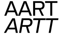
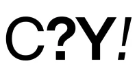
In some sense it’s extremely boring. Type design is really not something that you want to watch someone doing, in all honesty. The process is pretty mundane. What I love about it is, a) I seem to like repetitive tasks, and b) the ability to inject life is done through the culmination of minute decisions. Deciding to adjust the leg on the capital R, which in this typeface turns this right angle but has a little flick on its foot at the end. It’s pulled in slightly, so it has an awkward quality. It’s not about a perfect proportion. It’s about a workman-like engineering approach to a letterform. These are some of the ideas that I was really trying to imbue in all this decision making, this notion of a letterform that might be drawn by someone that’s not a craftsmen perhaps, but someone that was more like an engineer, that has a workman-like approach, something quite pragmatic, perhaps. It was interesting as we got further down the process, really thinking about the history of the place, we find nice cues to align the thinking, in terms of how I was deciding to approach letterforms and the history of this place that people had gone through, and what sort of skill sets they had developed in this location.
ML
Julia, what does it mean for you as the client to have your own unique typeface?
JG
For us it was a beautifully considerate response and it was also a complete surprise. We hadn’t realised that TCYK and Vincent had been collaborating until that point of the presentation. It was the best surprise, but I think it really encapsulated a lot of the things that we needed to say and did it so simply. We needed something that was really grounded in that particular location, and that’s what the survey of the letterforms obviously informed. We needed something that spoke to usability and that history of making and workmanship and crafting – the buildings were previously home to a trade school, a vocational school. It was a beautifully expressive and simple way to say all of those things, and also gave us a tool to use. It’s been a huge asset.
ML
Tell us more about the name Turnery. How do you name a typeface? And I understand this was quite a collaborative effort.
VC
It’s a great question. It’s one of those questions like, how do you pick that band name? Why did you name your child that? Oftentimes they have great stories, but more often than not they have really mundane stories. We went through quite a process back and forth, throwing out some options, again, mining the history of the place and really trying to figure out what kind of term would embody this air of industry and an anonymity, which we were really trying to channel, yet that wasn’t too obvious. We initiated this idea of involving Julia and CAP in the naming as a nice gesture to embed the history in the typeface. The typeface, technically speaking, is not a custom face under an exclusive agreement. Interestingly, I think some of the ethos of the project was to get at this notion of not holding onto things too tightly, to being open containers. It wasn’t about ownership and locking things down, and so the typeface actually has a life beyond this particular expression, but it gave us a really nice opportunity in the naming to embed some of the history in the process.
LB
We discussed licensing. We talked about it extensively thinking about the pros and the cons, and it seemed disingenuous to hold on to this font and make it just our own precious little thing that no one else can use. It seemed that the best approach was for Vincent to license it, to offer it available to be licensed. This typeface has a starting point in Collingwood Yards and the name is a reflection of that. But beyond that, it’s interesting to see how this typeface can grow and evolve and be used in other designers’ work and people’s brands.
JG
I feel like it’s a good opportunity to say thank you to both of you for the generosity that you approached it with. You don’t have to include that, it just felt right to say.
ML
I am going to follow that up though, what do you mean generosity?
JG
Both TCYK and Vincent understood and continue to understand that as a community project, there’s just a lot of stakeholders. They’ve had patience with that process and they’ve had to educate quite a lot of people along the way about the value of a typeface and the value of this kind of restrained design. That is a job that not all typographers and design agencies take on.
